I have just finished reading The Speechwriter, by Barton Swaim. It’s an account of the writer’s experience as speechwriter for the Republican politician Mark Sanford, whose presidential ambitions were crushed by revelations of an extramarital affair. Sanford isn’t mentioned by name but is readily identifiable. I found the the book to be an awkward mixture of the illuminating and the patronising, as Sanford demands of his idealistic speechwriter that he write less well and more in the language of the common man or woman – which doesn’t seem unreasonable, but which is a source of much of the book’s humour. It’s an entertaining read, however, and has been widely praised. Expect a feature film version in due course.
But something that I did like about the book was its spine. Not its metaphorical spine, but its actual spine. As well as bearing the title and the name of the author, the spine (third from left in the above photo) shows in series a piece of paper being converted into a plane. Emblematic of the author’s frustration with his art and his employer, it is a witty and eye-catching conceit. And it got me to thinking about the overlooked art of book spines.
Much attention is given to the covers of books, but who ever writes about their spines? It is book spines that we first encounter in bookshop and on library shelves. It is book spines that invite, direct and inform us as to what we may wish to read. Their design is crucial to the book’s identity and to its discovery (what a tragedy it is to find a book whose spine has been so worn down that once can no longer read it, as with Tennyson’s Idylls of the King, above second left – I always check out such orphans when in second-hand bookshops, out of pity).

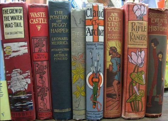
A hundred years ago or more, book spines were wholly functional – a means to identify only. Ornate, often floral, designs began to appear for novels in the late nineteenth century, particularly for children’s books, and these are now the delight of some collectors. They showed how the spine could be an expression of the book’s contents, and how it could serve as advertisement. But they were for books of a relatively narrow kind. What is of greater interest is the way in which all book spines now aim to catch the eye.
A book spine has three obvious functions. It must tell us the title of the book; it must tell us the name of the author; and it must give us the name (with logo) of the publisher. But beyond these it must reflect in concentrated form the intentions of the book’s overall design – it both complements and summarises that which is stated by the book’s front and back. It must be an expression of the publisher’s identity, not just through a name and logo, but through colour, font, layout and particular quality of presentation. It must stop us in our tracks; it must make us look twice.
It must be beautiful. The book spine – the well-designed book spine, that is – is an artful arrangement of text within space. The ideal is harmony matched by instant readability. And this needs to be achieved with text that is in most cases written sideways. I’m no historian of the book, but judging from my own shelves and a couple of second-hand bookshops nearby, the text on book spines was almost always written horizontally up to the 1930s, as illustrated by Stamboul Train. A few narrow cheap novelette publications from the late Victorian era had vertical writing on the spine, but the vast majority fitted in the text horizontally no matter how narrow the spine nor how much the text needed to be broken up to achieve this (for example, the clumsy splitting of Lucretius’s name for the Everyman edition of The Nature of Things).
The switch to vertical text seems to have come with the growth in book publication during the Second World War period, and to have been driven by the rise of the paperback – in particular Penguin paperbacks. The first Penguin was published in 1935, Ariel, a biography of Shelley by André Maurois. What is striking about the spine, apart from its clear expression from the start of the Penguin identity, is that the text has to be viewed from bottom to top. The first Penguins were all designed the same way, and other books from the same period reveal the absence of a consensus of how the vertical text should be read (see Karel Capek’s How They Do It, published in 1945).
Nowawdays the majority of books published in the UK have vertical text on their spines arranged from top to bottom, demanding that we tilt our heads to the right and scan the selves from left to right. It’s a cultural decision, which is not always followed elsewhere – in continental Europe the text mostly runs from bottom to top (see Le Grand art de la lumière et de l’ombre). Why such perversity, contrary to the way in which the Western eye will track along a page? I do not know, and at some point (in the 1950s?) Penguin bowed to convention and switched its spine texts around, and now one can browse the shelves of any UK bookshop or library and tilt the head to the right, with rarely any rude interruption demanding that we adjust our angle of sight and gain a crick in the neck at the same time.
However book spines today are more varied than that. The horizontal form of text remains, particularly for thicker books which are keen to express their weighty importance. Many combine vertical with horizontal, as with Publish and Be Damned (main title vertical, subtitle and author’s name horizontal). Sometimes the effect can be clumsy – the Oxford Shakespeare awkwardly arranges the title (which is also different to the title give on the front cover) vertically, when horizontal harmonisation with the rest of the text would have worked better. They are increasingly visual, often featuring elements on the main cover design or featuring a wrap-around image so that the spine encourages you to view the completion of the image on the front, as with Ben Wilson’s The Laughter of Triumph.

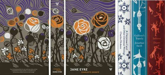
Some book now have spines that are treated as works of art. Many revere the work of designers such as Coralie Bickford-Smith or David Pearson’s White Books. Personally I find these a bit on the vulgar side. Books are for reading, not for viewing as art objects. Their design must always be subservient to their function, like architecture. Spines have also been used for book series in which an image appears only when you have the full set. This is momentarily clever but ultimately mere gimmickry, and has little to do with reading.

There are things that spines don’t do. The text may be vertical, horizontal or a combination of the two, but the images are always upright. Despite sideways text demanding that we lean rightwards, the images are never arranged to complement this. Is this lack of imagination on the part of cover artists, or would a sideways image break some unwritten law of design? Will anyone one day try? Or are there examples out there that I just haven’t managed to track down?
Given their primary function as advertisements, it is surprising that book spines are not used more for promotion than they are. Images of biographical subjects occur not infrequently on spines, but images of authors themselves, such as Andrew Marr for My Trade, are surprisingly rare. Rarer still are recommendations, such as the starry statements included on the spine of the paperback edition of Team of Rivals (neatly incorporated into the USA-themed design).
A good spine tells you what you need to know. A great spine achieves this with a beauty all of its own. By the Sword, a history of fencing and duelling, depicts the range of its subject matter through a series of small but clear illustrations, similar to The Speechwriter, and also quite different in design to its front cover. The spine has a character all of its own. Different Every Time achieves impact through a distinctive font that fills up much of the available space (while still incorporating the helpful subtitle), immediately standing out from any book alongside it. It also differs from the front cover, which is black with yellow lettering – the spine its complement in negative. The Culture of Time and Space echoes its subject through an adroit arrangement of text (similar to but not quite the same as used on its cover), commanding attention through disalignment.
The spine’s primary function is to advertise, but once the book is owned its chief functions are to remind and to please. We need to find the book again, but it also serves a visual purpose. Books do furnish a room, and for this books need to work together. Their promise lies in their variety. There is something deeply appealing about a set of books on a shelf, and it is the varied kinds of book spines that creates this. The heart sinks at rows of books with uniform spine design, which reeks of books to be shown and never read. The higgledy-piggledy arrangement of titles, names, colours and sizes, each calling out to be read, shows that book spines work because they do not exist alone. They come alive in company. They form the domestic gallery. They are what saves us from bare walls and barbarism.
Links:
- The ingenious arrangement of book spines to form poems or commentaries is a delightful meme – just search for images of ‘book spine poetry’ or try out the Book Spine Poetry site
- There’s an entertaining and well-illustrated paean to the modern book spine at First Second Books
- David Pearson is an auteur among book designers, it has to be said

Wonderful, nostalgic tour through the recent history of spines. Since books do indeed furnish various rooms in our house, not to mention landings and alcoves, I realise that much of my present-day relationship with my books is through their spines. Seeing them, I’m vaguely reminded of their contents; so they also furnish my memory as I move through the house. And with a rising tide of grandchildren, there’s always the hope that some of these will get opened again (even the Hentys and Vernes?) and lodge themselves in some juvenile 21st century minds?
Thank you Ian. I should have added something about spines as a trigger for memories. I’m reminded of a favourite film scene of mine, in Diary of a Shinjuku Thief, in which a character pulls out books from a shelf and as she does so the words within them begin to speak. It’s a beautiful conceit, grounded in truth.
Well, having written that I’d not seen a book spine with images sideways on the same as the text, I then spotted an example just one day later. The above-mentioned Coralie Bickford-Smith’s much-acclaimed picture book The Fox and the Star has an image of a beetle sideways on between the book’s title on the spine. Small, but maybe revolutionary. I can’t find an image of the spine online (which tells its own story), but if anyone finds another example, do let me know.