Two years I wrote about an exhibition of the remarkable infographics of W.E.B. Du Bois, one of the founders of the National Association for the Advancement of Colored People, and said that I was working on an exhibition of infographics myself, due to be shown at the British Library in August 2020. Then fate intervened.
Two years on, one pandemic later, and the exhibition has happened. While the spotlight is going to be on Breaking the News, the British Library’s high profile exhibition on the history of news in Britain, with which I have been associated, the smaller Visualising Victorian News is taking place in the same building at the same time. And I’m quite pleased with it.
The idea for it started back in 2016 when I came across a copy of the book Visual Storytelling: Infographic Design in News, by Lu Yikun and Dong Zhao. It was a showcase of work done by infographic artists around the world to express news and current affairs topics in visual form. It was a potent advertisement for the power of data journalism, and I thought to myself, how interesting if this approach could be applied to historic news data. Part of the day job is working on the digitisation of newspapers, which means not only that you create digital images of the physical originals, but that you extract information from the digitisation – text and layout – which can be used as research material in its own right. I was interested generally in showing how one can link approaches to current news to methods used for the study of historic news. A project suggested itself.
It took a while, but eventually I found a small pot of money (actually three smaller pots of money combined into one), a researcher who could manage the work (Yann Ryan, who was curator of newspaper data at the British Library, an experimental role I had set up with only vague ideas of what it might do), a theme (news stories from the Victorian era), some likely topics, and some artists.
We ended up working with three artists: Tiziana Alocci, Ciaran Hughes and Erik Nylund. We soon learned that text data from digitised newspapers was not enough itself – the information derived was too impressionistic – so we had to identify other data sources to complement this, which in turn led to many complication regarding licences for re-use. We knew we had to work with researchers who not only knew the Victorian era but who had produced or worked with data as part of their research and understood how it could be re-used to express concepts visually (in the end, for assorted practical reasons, Yann and I undertook the research for some designs).
We also learned about storytelling. All news is storytelling, and infographics are simply another way of getting the story across. Some can be a simple design, expressing cause and effect in an eye-catching manner. Others are more complex, bringing in the historical roots of a story, comparative data, sub-narratives and a range of characters. The latter was what we wanted to do.
Good data does not necessarily mean a good story. In some case we had some terrific datasets, or so we thought, but for assorted reasons they did not work in narrative terms. For instance, I regret that we were unable to work with a rich dataset we had on Phonograph recordings of the late Victorian era, which would have showed the spread of recorded music and could have been linked to a Spotify list. Another set of data covered migration and British Empire trade, fabulously well, but on too big a scale for us to tell a clear story on a single design (in the end we pruned it down to one topic, tea). Other topics fell by the wayside simply because we could not identify, or licence, the right set of data. So the story of W.G. Grace as sportsman and Victorian icon must be left for some other data scientist to tell.
For each piece of work we supplied the designer with a background to the history, a spreadsheet with several sets of data that could be used for analysis, a set of re-usable images, and some guidelines on what argument we wanted the design to express. One of the great pleasures of the project was how original ideas evolved through discussion with the designers, so that the work was not a case of delivering a set of instructions and waiting for the results, but rather a collaborative process. We learned more about the topic, and what the data could be made to say, through the development of the design. Art and evidence brought together created discovery.
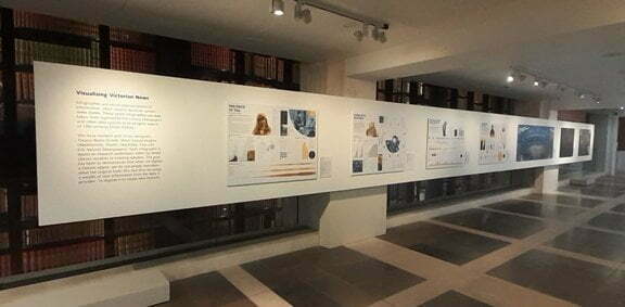
We ended up with seven designs. If you are able to come to the British Library, at St Pancras in London, you will find them in the entrance hall, on the upper ground floor, at the base of the glass tower of books once owned by King George III. They are hard to miss.
The seven designs, with their artists and researchers are:
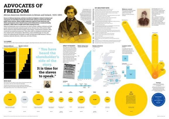
Advocates of Freedom. The story of 19th-century African American abolitionist speakers touring Britain. Designed by Ciaran Hughes, based on the research of Hannah Rose-Murray (University of Edinburgh).
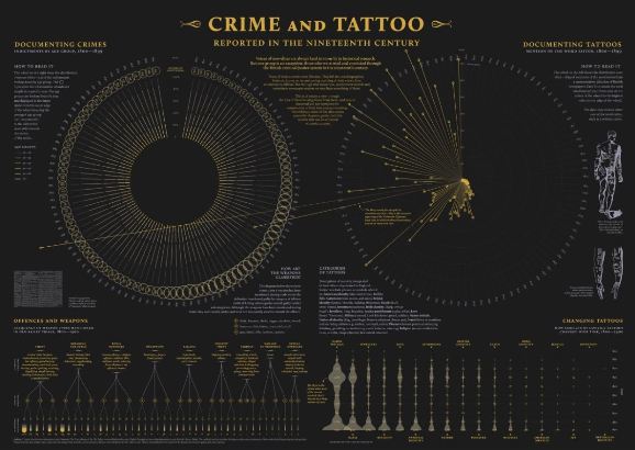
Crime and Tattoo. The evidence left of those convicted of crimes in the nineteenth century, in trial transcripts, punishment records, newspaper reports and their tattoos. Designed by Tiziana Alocci, based on research by Robert Shoemaker, Sharon Howard and Jamie McLaughlin (University of Sheffield), and Zoe Alker (University of Liverpool).
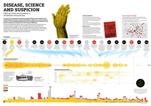
Disease, Science and Suspicion. The fights against cholera and smallpox. Designed by Ciaran Hughes, research by Luke McKernan (British Library) and Yann Ryan (Queen Mary, University of London), developed out of work by Ian Gregory and Catherine Porter.
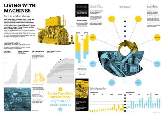
Living with Machines. Reactions to industrialisation in nineteenth-century Britain, analysed through newspaper coverage. Designed by Ciaran Hughes, research by Daniel Wilson (Alan Turing Institute), code and analysis by Mariona Coll Ardanuy (Alan Turing Institute) and Yann Ryan (Queen Mary, University of London).

The Price of Tea. The rise in popularity of tea among the British over the nineteenth-century, shown against the impact on Indian plantation workers. Design by Ciaran Hughes, research by Luke McKernan (British Library).
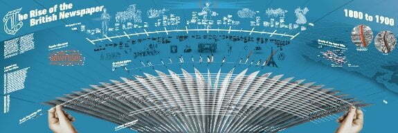
The Rise of the British Newspaper. The British newspaper 1800-1900 as a multi-layered timeline of general historical events, news industry developments and readership figures. Design by Erik Nylund, research by Luke McKernan (British Library) and Yann Ryan (Queen Mary, University of London).

Time, Fire, House. The Crimean War seem through the words used to document it in newspapers of the time. Design by Tiziana Alocci, research by Luke McKernan (British Library) and Yann Ryan (Queen Mary, University of London).
Each design is accompanied by a label identifying all of the sources used (data sources and secondary texts), the designer and the researchers involved. So we are illustrating the process, not just the results.
I find this sort of work so compelling. Aside from the personal pleasure in seeing complex designs emerging out of raw data and ideas, there is something particularly hypnotic about news stories, or histories, presented in this form. There is the balance between evidence and design, the interrelationship between images, text and tables, the visualisation of a process through time, the use of colour coding to link up concepts, the sheer creativity that data can inspire. The result is like a piece of detective work where we know the end but are presented with all of the evidence and the clues that led to the conclusion.
A good infographic does not just explain a process through visualisation. A good infographic shows our minds at work.
All images copyright of their respective artists
Links:
- Visualising Victorian News runs at the British Library until 21 August 2022
- There is a special event at the British Library on 26 April, Beautiful News / Visualising Victorian News, with a preview of the exhibition and presentations by the three designers and perhaps the most celebrated of all infographic artists, David McCandless, author of Information is Beautiful and Beautiful News
- You can see more of the work of the three designers on their personal sites: Tiziana Alocci, Ciaran Hughes and Erik Nylund