
If I’m not writing as much as I would like to, it’s because I’m working on a great many things, and when it gets to the evenings I’m just tired. But I hope it’s all going to be worth it. One of the projects is a small exhibition of infographics, to be held this August on the second-floor gallery of the British Library. It hasn’t got a name yet (we have committees to decide such things – we have committees for everything), but I think its subject is quite novel.
Back in 2016, having been inspired by a book of news infographics from around the world, I wondered what it would be like if professional infographic designers could instead work on data from historical newspapers, once we at the British Library had digitised them. This idea lingered at the back of my head, until some suitable money turned up, and the project became reality. We are going to employ three artists who will produce seven large-scale infographics on British nineteenth-century themes, using data from digitised newspapers augmented with some harder data from other sources, as data extracted from newspaper texts alone is necessarily impressionistic. That’s interesting in itself, but we’ll need hard facts to go alongside more speculative notions. The small exhibition will take place on the second-floor gallery of the British Library at St Pancras, London, from 14 August 2020.

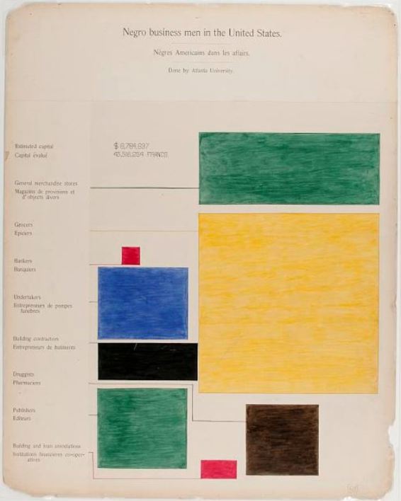
I’ll write more on this project nearer the time. The reason for raising now is to acknowledge some great work done with infographics at the end of the nineteenth-century, currently on show at the House of Illustration in London’s King Cross area. ‘W.E.B. Du Bois: Charting Black Lives‘ exhibits a series of infographics produced by the black American intellectuals W.E.B. Du Bois and Booker Washington, with lawyer Thomas J. Calloway, for the 1900 Paris Universal Exposition. I knew in general terms about Du Bois as an eloquent and influential advocate, one of the founders of the National Association for the Advancement of Colored People, but the exhibit made for the 1900 Exposition strikes you like a thunderbolt – the past speaking in our language, using our signs. These were people who thought ahead.
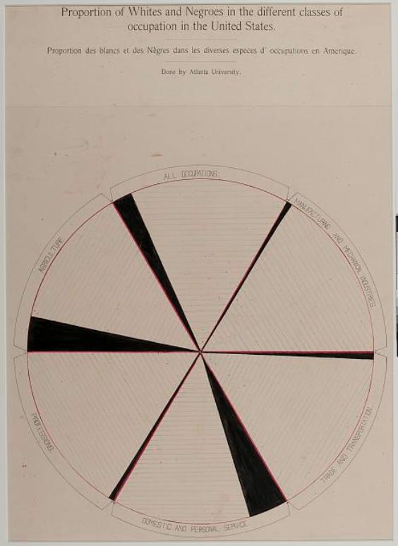
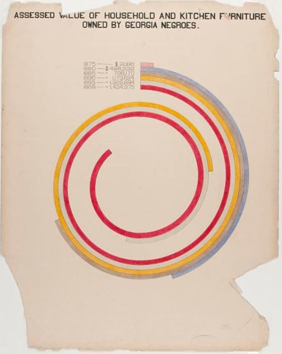
The exhibit, produced with the assistance of students at the black colleges of Atlanta University and Tuskegee University, used photographs, maps, texts, books by black authors, and infographics to document the lives of black Americans in the years after the ending of slavery, with emphasis on their value to society and to the economy. Du Bois and Washington wrote and spoke on these things elsewhere – here they translated empirical data into unimpeachable visualations.
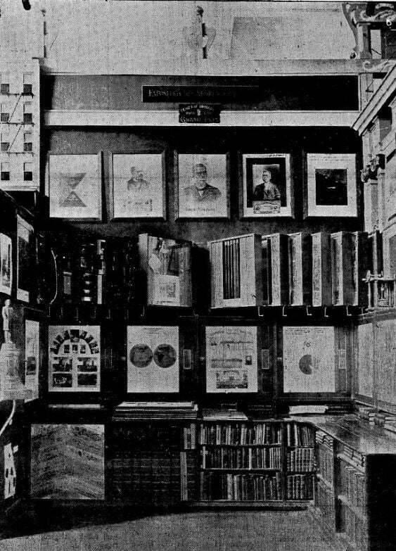

The infographics, displayed at the House of Illustrations much as they were in Paris, on a series of movable boards attached to the wall, use data covering Georgia and the USA as a whole to argue the case for all that a liberated black population had already achieved, given education, property rights and work opportunities.
What is so striking about them is their combination of timeless modernity with 1900 charm. The abstract designs have all the arresting qualities of the graphs, bar charts and other data visualisations that we use to analyse the world today, yet have pre-computer age colourings that give them a human character that our present slick productions inevitably lack. One senses the pencil in the hand, the careful application of colour, the earnest craftsmanship.
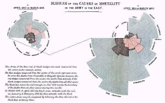
Infographics were a creation of the nineteenth century. Though there are isolated predecessor examples from earlier centuries, the idea of representing data in visual form to make clear arguments was developed in the 1820s by geographers and was most famously employed by Florence Nightingale in 1857 to argue the case for improvements to military hospitals. Though some of the forms of visualisation that she utilised, such as pie charts, were not new, her examples had a particular vitality and persuasiveness about them, while her ‘coxcomb’ design, displaying data through the separated sectors of a circle, was a startling innovation. Du Bois and his colleagues used the coxcomb, pie charts, graphs, bar charts, coloured maps, and more, to make their arguments stand out.
The infographics impress us in 2020, but what about 1900? Reports on the Exposition suggests that the exhibit, thought recognised as worthy, was but one small display among thousands, struggling to be seen by anyone with influence. Volume five of the official US report on the Exposition notes the display almost in passing midway through one paragraph, on page 663:
The case next this one presented organized denominational work; the Girls’ Friendly Society and St. Paul’s Normal and Industrial School, at Lawrenceville, Va., under the auspices of the Protestant Episcopal Church; the work of Viddle University, at Charlotte, N. C., under the auspices of the Presbyterian Church; of Shaw University, at Raleigh, N. C., under the auspices of the Baptist Church; and of Fiske, Tougaloo, and Straight universities, under the auspices of the Congregational Church. This presentation of religious and educational work among the colored young people in the South was an excellent addendum to the fine exhibition made under the National Bureau of Education, showing the progress of the colored race since their emancipation from slavery, which was installed in the same room, although in charge of another jury.
Did they persuade? How did they persuade? Perhaps it doesn’t matter. The purpose of an infographic may not be to win an argument, but to encapsulate the clarity of an explorable idea. It first engages the eye, draws you in, then lets the idea unfold. It is a classical form of argument, expressed visually. You could call it visual oratory, where what is said is important, but how it is said is still more important. Victory lies in eloquence.
Links:
- ‘W.E.B. Du Bois: Charting Black Lives‘ runs at the House of Illustration until 1 March 2020
- All of the infographics can be seen on the Library of Congress display African American Photographs Assembled for 1900 Paris Exposition
- There’s a background piece to the exhibition by Danny Lewis, with links to reviews, on the Smithonsian Magazine site
- I’ve written about infographics and news data on the British Library’s Newsroom blog